
If you’re a scientist or a student studying biochemistry, you must have come across Michaelis–Menten kinetics at some point. The plot is widely used to analyze enzyme kinetics, especially in biochemical studies. While making it can seem like a daunting task, creating a Michaelis-Menten plot in Excel is a simple process that even beginners can master. In this tutorial, we’ll guide you through the step-by-step process of making a Michaelis-Menten plot in Excel, including key terms, formulas, and instructions on how to create a graph that’s easy to read and understand.
Before we delve into creating a Michaelis-Menten plot in Excel, it’s essential to understand the key terms and formulas that go into the plot. Michaelis-Menten kinetics is a mathematical model that describes the behavior of an enzyme-catalyzed reaction. The model has two fundamental constants: Vmax, which is the maximum rate of the reaction, and Km, which is the substrate concentration at half of Vmax.
For a better visualization of Michaelis-Menten kinetics, we need to plot enzyme velocity (V) versus substrate concentration ([S]) on a graph. The resulting curve is the Michaelis-Menten plot.
The first step in making a Michaelis-Menten plot in Excel is to prepare your data. We need to measure the reaction velocity of an enzyme (V) under varying substrate concentrations ([S]). Get your data organized in an Excel spreadsheet, with one column for [S] and another for V.
Once you’ve entered your data, the next step is to calculate Vmax and Km from your data. First, select two data points from your dataset, one with a high [S] value and the other with a low [S] value.
Next, use the following formulas to calculate Vmax and Km:
Vmax = maximum velocity = highest V value on the graph
Km = (Vmax/2) = substrate concentration at half of Vmax
Now that we have calculated Vmax and Km, it’s time to create a scatter plot in Excel.
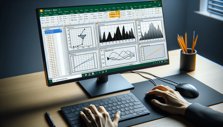
To do this, select the two columns of data you want to include in the plot. Then, navigate to the “Insert” tab and select “Scatter” from the “Charts” group. This will create a default scatter plot.
Next, format the scatter plot to turn it into a Michaelis-Menten plot. First, remove the vertical axis and format the horizontal axis to become a logarithmic scale. This can be done by right-clicking the horizontal axis and selecting “Format Axis.” Then, select “Logarithmic Scale” under the “Scale Type” section.
Next, add a trendline to the scatter plot. This can be done by right-clicking any data point and selecting “Add Trendline.” Under the “Trendline Options” section, select “Linear” and check the box that says “Display equation on chart.”
Finally, we need to insert Vmax and Km values into the equation displayed on the scatter plot to get the final Michaelis-Menten plot. Replace “y” in the equation with “Vmax,” and replace “x” in the equation with “([S]/Km + 1)”. This will give you an equation in the form of V = (Vmax * [S])/(Km + [S]).
Now that you have the Michaelis-Menten equation, you can plot the equation on the same scatter plot to get the final graph.
Making a Michaelis-Menten plot can seem intimidating, especially if you are a beginner. However, with the above step-by-step guide, you can create one with ease using Microsoft Excel.
Remember, the key to making an accurate graph is to ensure that your data is well-organized, and your equations and formulas accurately represent your data.
Creating a Michaelis-Menten plot in Excel requires precise calculations and careful attention to detail. Here are some tips to help ensure that your graph is accurate:
While Microsoft Excel is undoubtedly one of the most popular tools for creating Michaelis-Menten plots, there are other alternatives out there that you can use. Here are some software packages commonly used in scientific research to create Michaelis-Menten plots:
GraphPad Prism is a popular software package used in scientific research. It allows users to create Michaelis-Menten plots using a user-friendly interface, making it easy to fit curves, calculate kinetic parameters, and generate publication-ready graphs.
OriginPro is another software package widely used in scientific research that allows you to create Michaelis-Menten plots. It comes with built-in tools for curve fitting, statistical analysis, and graphing, making it a popular choice in the scientific community.
For those familiar with programming languages, R is an open-source, statistical programming language that can be used to create Michaelis-Menten plots. R has a wide range of packages suitable for the job, including ggplot2, which allows for customized and publication-quality graphics.
A Michaelis-Menten plot is an essential tool for analyzing enzyme kinetics, and creating one in Excel is a simple process that even beginners can achieve. Remember to pay attention to detail and to accurately calculate your data to produce accurate and reliable results. If you’re having trouble creating a graph using Excel, consider trying one of the alternative software packages mentioned above. With the right tools and a bit of practice, creating Michaelis-Menten plots will become second nature.
Here are some frequently asked questions related to making a Michaelis-Menten plot in Excel:
A Michaelis-Menten plot is a graph that shows the velocity of an enzyme-catalyzed reaction relative to substrate concentration. The plot is used to analyze enzyme kinetics and to determine important parameters such as Vmax and Km.
A Michaelis-Menten plot is important because it allows scientists to determine the fundamental kinetic parameters of an enzyme. These parameters are essential for understanding the underlying mechanisms of enzyme-catalyzed reactions.
Yes, you can create a Michaelis-Menten plot in Excel. The process involves preparing your data, calculating Vmax and Km, creating a scatter plot, formatting the plot, and inserting Vmax and Km values into the equation.
There are several other software packages you can use to create a Michaelis-Menten plot, including GraphPad Prism, OriginPro, and R Programming Language.
Some tips for creating an accurate Michaelis-Menten plot include ensuring that your data is well-organized, choosing an appropriate regression method, collecting a range of substrate concentrations, labeling your axes, and including a legend on your plot.
Explore the world of Microsoft PowerPoint with LearnPowerpoint.io, where we provide tailored tutorials and valuable tips to transform your presentation skills and clarify PowerPoint for enthusiasts and professionals alike.

Your ultimate guide to mastering Microsoft Word! Dive into our extensive collection of tutorials and tips designed to make Word simple and effective for users of all skill levels.

Boost your brand's online presence with Resultris Content Marketing Subscriptions. Enjoy high-quality, on-demand content marketing services to grow your business.