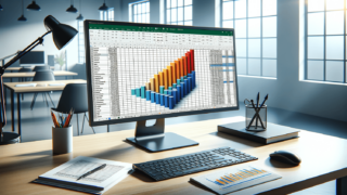

Excel is a powerful tool that makes data analysis easy and efficient. One of the most commonly used features in Excel is the creation of histograms, which are useful for displaying data distribution in a visual way. A histogram is a graph that plots the frequency of data points falling into specified intervals. It can help you identify patterns and trends that you might not be able to see just by looking at the raw data. In this blog post, we will walk you through the steps to create a histogram in Excel, so you can start analyzing your data with ease.
The first step to creating a histogram in Excel is to prepare your data. Ensure that the data is in one column and that it’s well-organized. Remove any duplicate entries and blank cells that may skew your results. For example, let’s say you are trying to create a histogram of student grades for a particular exam. You may have a list of grades in column A, so make sure that this list is complete and formatted correctly before proceeding to the next step.
The next step is to create bins. Bins are groups of values that will represent the intervals on the histogram. These intervals are used to count how many values fall within each bin. To create bins, you can use the “BIN” function in Excel. Here’s how you can do it:
Adjust the intervals until you have enough bins to represent your data accurately. Once you have done this, your histogram bins are ready for use.
Once you have created your bins, you can now create a histogram in Excel. Here’s how:
Interpreting your histogram is the final step. You’ll need to read the data and see what patterns emerge. For example, is the data normally distributed? Are there values that are outliers or outside of the expected range? These insights will help you understand your data better and make more informed decisions.
While creating histograms in Excel is relatively easy, there are a few useful tips that you can keep in mind to make your charts more effective. Here are some of them:
The bins that you create for your histogram should be arranged in such a way that they provide enough detail for your data without becoming too complex. If you have too few bins, the chart might not give enough information, while too many bins may create unnecessary noise. A general rule of thumb is using between 5 and 20 bins, but the right number depends on the data you’re working with.
Labelling your axis is crucial for interpreting your histogram correctly. On the X-axis, label each bin with the range of values it represents, while on the Y-axis, label the number of occurrences or the relative frequency of values within each bin. Doing so will make your chart more intuitive and easy to read.
Excel has various customization options that you can use to make your histogram clear and easy to read. For instance, you can adjust the color of the bins or the color of the chart background. You can also add labels, annotations, and other forms of visual aids to your chart. Experiment with various options to discover what works best for your data.
The size of your data set can impact how effective your histogram is in communicating information. If you have too many data points, the histogram might become cluttered, and it might be difficult to read. On the other hand, too few data points might not give you enough information. Generally, histograms are ideal for data sets of around 50 to 100 data points. If your data set is large, consider using other forms of charts or graphs that might be more appropriate.
Histograms are useful for visualizing data distribution and identifying trends in data sets. With a few simple steps, you can create a histogram in Excel and customize it to fit your needs. Remember to label your axis and choose the right number of bins to ensure maximum impact and clarity. Happy charting!
Here are some common questions and answers related to creating histograms in Excel:
The purpose of creating a histogram in Excel is to visualize the frequency distribution of numerical data. Histograms help you understand how often specific values occur within a dataset and how they are distributed. Histograms can provide valuable insights into trends, patterns, and outliers in your data.
The optimal number of bins depends on the dataset’s size, distribution, and the level of detail you want to visualize. A good starting point is to use between 5 and 20 bins. To find the optimal number of bins, you can use one of Excel’s built-in functions.
Some common mistakes to avoid when creating a histogram in Excel include using too few bins, using too many bins, or not labeling the axis correctly. It’s also essential to avoid including outliers in your data as they can skew the histogram and make it difficult to interpret.
Yes, you can customize your histogram in Excel to suit your needs. Excel provides you with various customization tools to adjust the color, grids, and labels to enhance your chart’s clarity and readability.
Yes, You can create multiple histograms for your data in Excel. If you want to compare the distribution of two data sets, you can create a side-by-side histogram. To create a side-by-side histogram, you need to first create two bins and use the same number of bins for each data set.
Explore the world of Microsoft PowerPoint with LearnPowerpoint.io, where we provide tailored tutorials and valuable tips to transform your presentation skills and clarify PowerPoint for enthusiasts and professionals alike.

Your ultimate guide to mastering Microsoft Word! Dive into our extensive collection of tutorials and tips designed to make Word simple and effective for users of all skill levels.

Boost your brand's online presence with Resultris Content Marketing Subscriptions. Enjoy high-quality, on-demand content marketing services to grow your business.