
Welcome to this Excel tutorial on adding standard deviation bars! Standard deviation is a measure of how spread out a distribution is, and it is an important statistical tool for analyzing data. Adding standard deviation bars to your Excel charts can provide valuable insights into your data, making it easy to visualize the variation in your measurements. In this guide, we will go over the steps to add standard deviation bars in Excel, from calculating standard deviation to formatting your chart to display the data more effectively. Let’s get started!
The first step to adding standard deviation bars in Excel is to calculate the standard deviation based on the data you want to plot. To do this, select the range of cells that contain the data you want to analyze.
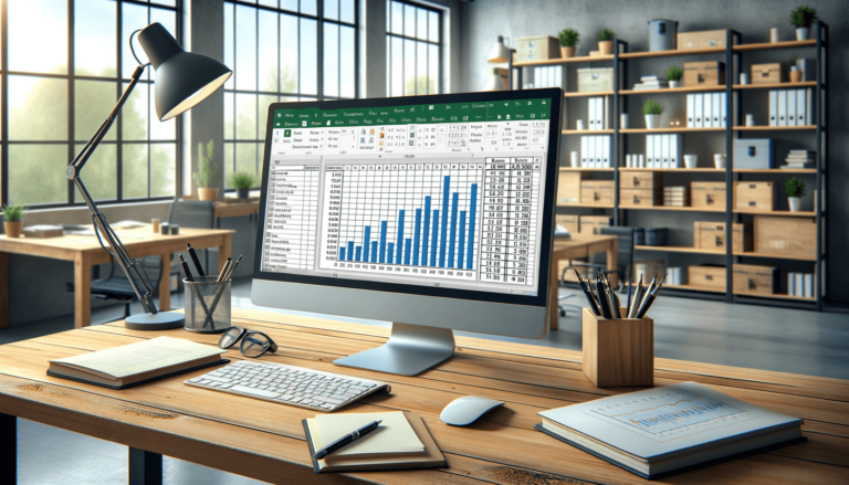
The next step is to create your chart, if you haven’t done so already. Select the range of cells that contain your data, then choose the type of chart you want to use. For this tutorial, we’ll be using a column chart.
Now that your chart is created, it’s time to add the standard deviation bars.
You can also customize the appearance of the standard deviation bars to better suit your needs. Here are some formatting options to experiment with:
Adding standard deviation bars in Excel is a quick and easy process that can provide valuable insights into your data. Here are a few final tips to keep in mind:
Standard deviation bars are a useful tool in many different situations, but they work particularly well when you’re looking to show the variations or differences in a set of data. Here are a few examples of when standard deviation bars can be useful:
In conclusion, adding standard deviation bars in Excel is a quick and easy process that can provide valuable insights into your data. By following the step-by-step instructions provided in this tutorial, you’ll be able to add standard deviation bars to your charts in no time. Remember to experiment with different formatting options to make your standard deviation bars stand out and be more eye-catching in your chart. Keep in mind that standard deviation bars are a useful tool in many different situations, so don’t hesitate to use them the next time you need to show variability or differences in your data.
Here are some frequently asked questions related to adding standard deviation bars in Excel:
Yes, standard deviation bars can be added to any chart type in Excel, including column, bar, line, and scatter charts.
Yes, you can add as many sets of standard deviation bars as you like, provided you have the necessary data to calculate them.
Excel offers several other types of error bars you can add to your charts, including standard error bars, percentage error bars, and custom error bars.
You can customize the appearance of your standard deviation bars by changing their color, thickness, and style. You can also change how the bars are displayed by modifying the error amount, end style, and direction.
Outliers or extreme values in your data can greatly affect the standard deviation, making it less representative of your dataset as a whole. One way to address this is to remove the outliers or transform the data to reduce their impact on the standard deviation calculation.
Explore the world of Microsoft PowerPoint with LearnPowerpoint.io, where we provide tailored tutorials and valuable tips to transform your presentation skills and clarify PowerPoint for enthusiasts and professionals alike.

Your ultimate guide to mastering Microsoft Word! Dive into our extensive collection of tutorials and tips designed to make Word simple and effective for users of all skill levels.

Boost your brand's online presence with Resultris Content Marketing Subscriptions. Enjoy high-quality, on-demand content marketing services to grow your business.