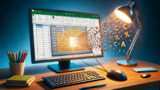

If you need to create a visual representation of data in Microsoft Excel, bar charts are a great tool to use. They are easy to read, understand, and offer an effective way to communicate large amounts of information quickly. This blog post will provide you with a step-by-step guide on how to create a bar chart in Excel in just a few simple clicks. Whether you are a beginner or an experienced Excel user, this guide will help you create a professional-looking bar chart in no time.
The first step to creating a bar chart in Excel is to enter your data into the worksheet. Make sure that your data is organized in columns or rows, with a title for each column, or row, where necessary. For example, if you want to create a bar chart to show the number of sales per month, you’ll need to enter the month names in one column and the sales numbers in another column.
Once you’ve entered your data, you’ll need to select it. Click and drag to highlight the data you want to include in your chart. Be sure to include any column or row titles you want to include in the chart as well.
After selecting your data, click on the ‘Insert’ tab and then select ‘Chart’ from the navigation bar. A variety of chart types will appear, including bar charts. Select ‘Bar’ from the list of chart types.
Now that you’ve selected your chart type, it’s time to customize it to your liking. You can edit the chart by adding or removing data series, changing the color or style of the bars, and adding titles or labels. Simply click on the chart elements you’d like to modify and choose the options you prefer.
Once you’ve created your bar chart and customized it, you can save it to your computer or share it with others directly from Excel. Click on the ‘File’ tab and then select ‘Save As’ to save the chart to your computer. If you want to share the chart with others, you can copy and paste it into an email or document or save it as a PDF.
Bar charts are a versatile tool, but it’s important to remember that they may not be the best choice for every data set. Here are some general best practices to keep in mind when creating bar charts:
While bar charts are a classic choice for visualizing data, there are many other chart types you can use, including:
To change the color of the bars on your chart, click on the bars you want to modify and then select ‘Format Data Series’ from the ‘Design’ tab. You can then select a new color from the options provided or use the ‘Fill’ tab to choose a custom color.
Yes, you can create a bar chart from pivot table data in the same way you would create a bar chart from standard worksheet data. Simply select the pivot table data you want to include in the chart and choose ‘Bar’ from the list of chart types in the ‘Insert’ tab.
To change the order of the bars on your chart, click on the chart and then choose ‘Select Data’ from the ‘Design’ tab. In the ‘Select Data Source’ window, click the ‘Edit’ button to adjust the order of the data series. You can also use the ‘Move Up’ and ‘Move Down’ buttons to change the order of the series in the chart.
Here are some frequently asked questions about creating bar charts in Excel:
Yes, you can create a stacked bar chart in Excel. A stacked bar chart shows how each category is divided into subcategories. To create a stacked bar chart, select ‘Stacked Bar’ from the list of chart types when inserting your chart.
To change the axis labels on your bar chart, click on the axis labels you want to change, then right-click and select ‘Format Axis’ from the dropdown menu. From there, you can choose your preferred axis label position or add a new label.
Yes, you can add data labels to your bar chart to make it easier to read. To do this, select the chart and then select ‘Add Chart Element’ from the ‘Design’ tab. Select ‘Data Labels,’ and choose the preferred position.
If you have negative values in your data set, consider using a horizontal bar chart instead of a vertical one to make it easier to compare the values. Alternatively, you can change the scale of the axis to accommodate negative values, so they don’t show as below the chart.
To make your bar chart more visually appealing, use color wisely, choose an appropriate font size, and use themes to match your chart to its intended audience or your company branding. Also, consider adding a border to the chart area to make it stand out.
Explore the world of Microsoft PowerPoint with LearnPowerpoint.io, where we provide tailored tutorials and valuable tips to transform your presentation skills and clarify PowerPoint for enthusiasts and professionals alike.

Your ultimate guide to mastering Microsoft Word! Dive into our extensive collection of tutorials and tips designed to make Word simple and effective for users of all skill levels.

Boost your brand's online presence with Resultris Content Marketing Subscriptions. Enjoy high-quality, on-demand content marketing services to grow your business.