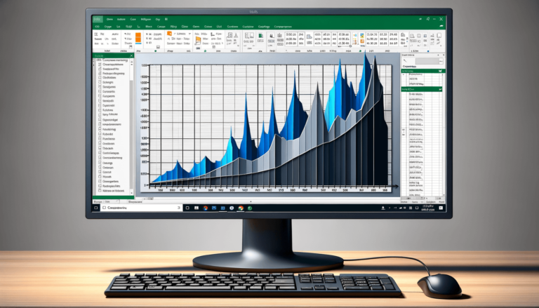

Welcome to our blog post titled “How to Plot a Graph in Excel”. Microsoft Excel is a software that is widely used in the business world to analyze data and create reports. One useful feature in Excel is the ability to plot graphs, which can make it easier to visualize your data and communicate your findings to others. In this post, we’ll guide you through the steps to create a professional-looking graph in Excel.
The first step to creating a graph in Excel is to choose the data that you want to plot. It’s important to format your data in a way that will be easy to understand visually. For example, if you’re plotting time-series data, you’ll want to make sure that the dates are in chronological order.
Once you have your data selected, click on the Insert tab in the ribbon at the top of the Excel window.
After selecting the Insert tab, you’ll see several chart types to choose from. You can preview each chart type by hovering your cursor over it. Once you’ve found the chart that best fits your data, click on it to select it.
For this example, we’ll be using a line chart, but the steps for other chart types are similar.
The next step is to insert your data into the chart. You can do this by clicking on the Chart Elements icon at the top right of your chart and selecting the data series that you want to add data to.
You can also edit the data series by right-clicking on the chart and selecting “Select Data”. From here, you can add, edit, or remove data series.
Now that you have your data in the chart, it’s time to customize it. You can edit chart elements such as the legend, axis labels, titles, and more by selecting the element and clicking on the Format tab in the ribbon.
You can also change the chart type by selecting the chart and clicking on the Change Chart Type button in the ribbon.
Experiment with different customization options until you’re happy with your graph.
Once you’ve finished customizing your graph, it’s time to save and share it. You can save your graph as an Excel file by clicking on File and then Save As. You can also export your graph as an image file by clicking on File and then Export.
When you’re ready to share your graph, simply insert it into a report or presentation. Your audience will appreciate the visual representation of your data!
Now that you know how to plot a graph in Excel, you can use this knowledge to analyze your data and communicate your findings effectively. Remember, the key is to choose the right chart type, format your data in a way that makes sense visually, and customize your chart to fit your needs.
While Excel offers many tools and options for graphing, it’s important to keep a few best practices in mind:
If you’re looking to take your graphing skills to the next level, Excel offers many advanced techniques that can help you create even more compelling graphs. These include:
While Excel provides many tools and options for graphing, don’t be afraid to get creative and think outside the box. Experiment with different chart types, formatting options, and color schemes to create graphs that clearly communicate your findings and capture your audience’s attention. With a little practice and creativity, you’ll be able to create professional-looking graphs that make your data come alive!
Here are some commonly asked questions about plotting graphs in Excel:
Yes, Excel allows you to plot multiple data series on the same graph by adding additional data to your chart.
To edit the colors of your graph, select the chart area and click on the Format tab in the ribbon. From there, you can select the colors of your chart elements, such as the data series, background, and axis labels.
The chart type you should use depends on the type of data you’re graphing. For example, if you’re graphing time-series data, a line chart would be most appropriate. If you’re comparing data across categories, a bar chart or column chart might be best.
To add a trendline to your graph, select the data series and click on the Chart Elements icon at the top right of your chart. From there, select “Trendline” and choose the type of trendline you want to add.
Yes, Excel allows you to create graphs with non-numeric or text data by converting the text data into numerical values. For example, you can assign numerical values to different categories or use text-to-columns to separate data into numerical values.
Explore the world of Microsoft PowerPoint with LearnPowerpoint.io, where we provide tailored tutorials and valuable tips to transform your presentation skills and clarify PowerPoint for enthusiasts and professionals alike.

Your ultimate guide to mastering Microsoft Word! Dive into our extensive collection of tutorials and tips designed to make Word simple and effective for users of all skill levels.

Boost your brand's online presence with Resultris Content Marketing Subscriptions. Enjoy high-quality, on-demand content marketing services to grow your business.
