How to Make a Semi Logarithmic Graph in Excel
Learn how to create a semi logarithmic graph in Excel with our step-by-step guide. Improve data visualization and make your charts more accurate.
May 20, 2023
This section guides you through creating and customizing various types of charts and graphs in Excel. Visualize your data and make meaningful interpretations with bar graphs, pie charts, scatter plots, and more.
Page 4 of 5
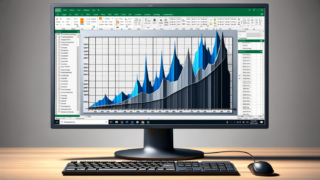
Learn how to create a semi logarithmic graph in Excel with our step-by-step guide. Improve data visualization and make your charts more accurate.
May 20, 2023
Learn how to easily create a stem and leaf plot in Excel with this step-by-step guide. Improve your data analysis skills and make informed decisions.
May 20, 2023
Learn how to create an X Y graph in Microsoft Excel with this step-by-step guide. Our tutorial walks you through the process of plotting data and formatting your graph.
May 20, 2023
Learn how to easily create an X Y Scatter Plot on Excel with this step-by-step guide. Organize and visualize your data to make better-informed decisions.
May 20, 2023
Learn how to create an XY graph in Microsoft Excel, step-by-step. This tutorial covers everything you need to know about plotting and labeling your data.
May 20, 2023
Learn how to move your chart to a new sheet in Excel and keep your data organized. Follow these simple steps to save time on data analysis.
May 20, 2023
Learn how to move the horizontal axis in Excel with this step-by-step guide. Improve your data visualization by customizing your charts and graphs.
May 20, 2023
Learn how to move the X-axis to the bottom in Microsoft Excel with this step-by-step guide. Improve the clarity of your charts and graphs.
May 20, 2023
Learn how to create a professional-quality pie chart in Microsoft Excel with our easy-to-follow guide. Follow these step-by-step instructions to create engaging visualizations of your data.
May 20, 2023
Learn how to create charts and graphs in Microsoft Excel with our comprehensive guide on How to Plot in Excel. Discover essential tips and tricks for effective data visualization.
May 20, 2023
Learn how to plot a graph in Excel with this step-by-step guide. From choosing the right chart type to formatting axis labels, this post has got you covered.
May 20, 2023
Learn how to remove gridlines in your Excel graph and make it look more polished and professional. Our step-by-step guide makes it easy for you!
May 20, 2023
Learn how to easily resize your charts in Microsoft Excel with this step-by-step guide. Discover tips and tricks to get your charts looking just right.
May 20, 2023
Learn how to effectively resize and reposition your charts in Excel to make your data more readable and presentable. Our step-by-step guide will show you how to do it efficiently.
May 20, 2023
Learn how to reverse axis in Microsoft Excel to better visualize your data using this simple step-by-step guide. Improve your Excel skills today!
May 20, 2023