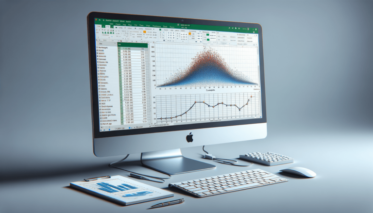
How to Make a Calibration Curve in Excel
Calibration curves are vital in scientific experiments as they help scientists to determine the concentration of unknown substances. Microsoft Excel is a powerful tool that scientists can use to create calibration curves because it has all the necessary features needed to create professional-looking graphs and charts. If you’re wondering how to make a calibration curve in Excel for your research work, you’ve come to the right place. In this post, we’ll walk you through the essential steps required to create a calibration curve in Excel, explaining each step in detail so you can get a quick and direct answer to your question.
Step 1: Gather Your Data
The first step in creating a calibration curve in Excel is to gather your data. You should have a set of known concentrations and corresponding measurements. Input your data into an Excel spreadsheet and label your columns. The first column should be the concentration, and the second column should be the corresponding measurement. Be sure to include units of measurement in your column labels.
Step 2: Create a Scatter Plot Chart
After inputting your data, select both columns of data. Go to the “Insert” tab and click on “Scatter.” Choose the scatter chart with data points connected by lines. This will create a scatter plot chart. Your chart should now appear on the same page as your data.
Step 3: Add a Trendline
Next, we need to add a trendline to our scatter plot chart. Click on your chart to select it. Go to the “Layout” tab and click on “Trendline.” Choose “Linear Trendline.” Your chart should now show a straight line cutting through the data points.
Step 4: Display the Equation and R-Squared Value
To see the equation and R-squared value for your trendline, right-click on the trendline and click on “Format Trendline.” Click on the “Options” tab and check the boxes for “Display Equation on Chart” and “Display R-squared Value on Chart.” Your chart should now display the equation and R-squared value for your trendline.
Step 5: Use the Calibration Curve
Now that your calibration curve is complete, you can use it to determine the concentration of an unknown sample. Measure the unknown sample, input the measurement into the equation of your trendline, and solve for the concentration. This will allow you to accurately determine the concentration of your unknown sample.
Conclusion
Creating a calibration curve in Excel may seem daunting at first, but it is a relatively simple process that can be done in a few easy steps. By doing so, you can ensure the accuracy of your scientific experiments and feel confident in the results you produce.
Choosing the Right Type of Trendline
Excel offers different types of trendlines other than linear trendlines. You can choose polynomial, logarithmic, exponential, and power trendlines depending on the nature of your data. If you’re unsure which type of trendline to use, you can add them all and compare their R-squared values. The trendline with the highest R-squared value is usually the best fit for your data.
Adding Error Bars to your Chart
It’s common to add error bars to a calibration curve to show the precision and accuracy of your data. Error bars represent the range of values for each data point, and they can be added to your chart by selecting a data point and clicking on “Error Bars.” You can customize the error bars to reflect standard deviation or a specific value range for each data point.
Creating Multiple Calibration Curves
If you have multiple sets of data to plot, you can create multiple calibration curves in Excel. Simply input each set of data into a separate spreadsheet and follow the same steps for each. You can create charts for each set of data individually or combine them into a single chart for easy comparison.
Best Practices for Creating Calibration Curves
When creating calibration curves in Excel, there are a few best practices to keep in mind. Always label your data appropriately with units of measurement. Use a consistent and sequential numbering system for your data points. Choose the appropriate type of trendline for your data and display the equation and R-squared value. Finally, be sure to test the accuracy and precision of your data by adding error bars.
Conclusion
Making a calibration curve in Excel is a simple process that can provide you with valuable data needed for your scientific experiments. By following a few simple steps and best practices, you can create a professional-looking calibration curve that is accurate and easy to interpret. Utilize the additional tips and techniques mentioned to refine your calibration curve and ensure the accuracy of your results.
FAQs
Here are the answers to some frequently asked questions about making calibration curves in Excel.
Can I create a calibration curve in Excel with non-linear data?
Yes, Excel supports different types of trendlines for non-linear data such as logarithmic, polynomial, exponential, and power trendlines. You can choose the appropriate trendline depending on the nature of your data.
How do I know if my calibration curve fits my data well?
The best way to check if your calibration curve fits your data well is to look at the R-squared value. The closer the R-squared value is to 1, the better the fit of your calibration curve to your data.
What is the equation used to calculate the concentration of an unknown sample using a calibration curve?
The equation used to calculate the concentration of an unknown sample using a calibration curve is y = mx + b, where y is the measured value of the unknown sample, m is the slope of the calibration curve, x is the concentration of the unknown sample, and b is the y-intercept of the calibration curve.
How do I add error bars to my calibration curve?
You can add error bars to your calibration curve by selecting a data point and clicking on “Error Bars.” You can customize the error bars to reflect standard deviation or a specific value range for each data point.
Why is a calibration curve important in scientific experiments?
A calibration curve is important in scientific experiments because it allows scientists to accurately determine the concentration of an unknown substance. This information can be critical when evaluating the effectiveness of a drug, analysis of environmental samples, or other experiments involving chemical reactions.