


Microsoft Excel is a powerful tool that can help individuals and businesses create powerful dashboards to better visualize and analyze data. A dashboard is a great way to summarize and display key information in a visually appealing manner. With just a few clicks and some basic data, you can create a dashboard that can help you monitor your financials, track sales, and highlight key performance indicators in an engaging and dynamic way. In this blog post, we will walk you through the steps to create a dashboard in Excel, so you can better leverage its features and capabilities for your data analysis needs.
The first step to creating a dashboard is to think about its purpose. Before you start creating charts and graphs, take time to understand what you want your dashboard to accomplish. Ask yourself questions like:
Once you have a clear understanding of your dashboard’s purpose, you can start designing it to fit your needs.
Before you create your dashboard, you need to make sure your data is formatted correctly and is easy to understand. Your data should be organized in a way that makes sense and is easy to read. Here are some tips:
Once you have set up your data, you can start building your dashboard.
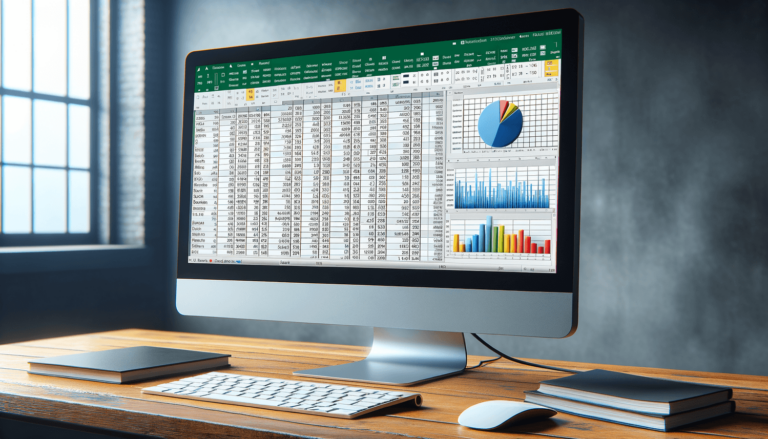
When it comes to creating a dashboard in Excel, choosing the right charts and visualizations is essential. Excel offers many different types of charts, including pie charts, bar charts, line charts, and more. Selecting the right chart for your data is crucial in creating an effective dashboard.
You can also use visualizations such as conditional formatting, data bars, and icon sets to make your dashboard more engaging and dynamic. For example, you could use conditional formatting to highlight cells that meet specific criteria or use icon sets to display status symbols.
The design of your dashboard is just as important as the data it displays. You want to make sure your dashboard is visually appealing and easy to read. Here are some design tips:
Your dashboard’s design should be user-friendly and intuitive, so your target audience can easily navigate it and understand the information presented.
Once you have created your dashboard, it’s time to share it with your target audience. There are a few ways you can do this, including:
Make sure to share your dashboard with those who will benefit from it, and be open to feedback to make improvements where necessary.
Creating a dashboard can be a challenging task, but Excel offers a wide range of features to help you create an effective dashboard. Here are some additional tips and tricks to help you get started:
PivotTables are a powerful tool in Excel that allows you to summarize and analyze large sets of data quickly. You can use PivotTables to group and categorize data, create summary tables, and more. They’re an excellent way to analyze your data and display it in a dynamic and interactive format.
Named ranges are a useful way to refer to a specific cell or range of cells in Excel. Instead of referring to a cell by its cell reference (e.g., A1, B2), you can give it a name that is easier to remember and reference. For example, if you have a data range called “SalesData,” you can refer to it by its name instead of its cell reference. This can be helpful when creating formulas or referring to data in your dashboard.
Slicers are a type of control that allows you to filter data in PivotTables, PivotCharts, and Excel Tables. They’re an excellent way to make your dashboard more interactive and allow your audience to visualize data in different ways. For example, you could use a slicer to filter data by a specific date range or product category.
Excel Macros are a way to automate repetitive tasks in Excel. They’re an excellent way to save time and create more efficient workflows. For example, you could create a macro that saves your dashboard as a PDF and automatically emails it to your team at the end of each month. Macros can be created using Visual Basic for Applications (VBA), a programming language built into Excel.
Creating a dashboard in Excel can be a challenging task, but with the right tools and techniques, you can create a compelling dashboard that effectively communicates your data. By following the steps outlined in this blog post and using the additional tips and tricks, you’ll be well on your way to creating a dashboard that drives your business forward and helps you make informed decisions.
While creating a dashboard in Excel can be a challenging task, there are several tips and tricks to help you get started. Here are some frequently asked questions about creating dashboards in Excel.
You can use any type of data in your dashboard that can be represented visually, such as sales data, financial data, marketing data, and more. Excel can handle large sets of data, making it an ideal tool to create dashboards of any size.
You do not need to be an Excel expert to create a dashboard. However, some basic knowledge of Excel, such as understanding functions and formulas, will help you create more complex dashboards.
You can make your dashboard interactive by using controls such as buttons, checkboxes, and slicers. These controls allow your target audience to filter data and to view different aspects of the dashboard in real-time.
The best way to share your dashboard is by saving it in a format that your target audience can access, such as PDF or Excel. You can also embed your dashboard in a PowerPoint presentation or share it via email.
It’s important to update your dashboard regularly, depending on how often the underlying data changes. For example, if you’re tracking sales on a weekly basis, you may want to update your dashboard every week. Updating your dashboard regularly keeps the information accurate and relevant.
Explore the world of Microsoft PowerPoint with LearnPowerpoint.io, where we provide tailored tutorials and valuable tips to transform your presentation skills and clarify PowerPoint for enthusiasts and professionals alike.

Your ultimate guide to mastering Microsoft Word! Dive into our extensive collection of tutorials and tips designed to make Word simple and effective for users of all skill levels.

Boost your brand's online presence with Resultris Content Marketing Subscriptions. Enjoy high-quality, on-demand content marketing services to grow your business.


